Xiaomi’s HyperOS has been one of the most talked about Android user interfaces (UIs) in recent times. The new operating system has a strong strain of Linux in it and replaces the long-standing and very popular MIUI that is seen on most Xiaomi phones and tablets. It is also said to be not just a phone or tablet OS but one that will work on and across the entire Xiaomi ecosystem, including home appliances and cars. It is supposed to run more smoothly and consume fewer resources. A lot of the talk around HyperOS has been of a highly technical nature (read its page to get an idea), and many have stressed that the major changes in the software are below the surface and are not very visible. A person looking at a device running MIUI and another running HyperOS might not be able to tell them apart for a while.

There are, nevertheless, some very clear differences between HyperOS and MIUI, especially when you use them side by side for a while. We have been using HyperOS on the Poco X6 Pro (the first phone in India to come with HyperOS out of the box) and the Xiaomi 13 Pro (which received it through an update) for about ten days now, and these are the ten things that we have noticed about HyperOS, especially compared to MIUI:
Table of Contents
HyperOS vs MIUI
At first glance, it seems the same as MIUI
You are not going to see any clear difference between a device running MIUI and HyperOS at first or even second glance. So, for instance, if you place the Poco X6 Pro (which runs HyperOS) and the Poco X6 (which runs MIUI 14) or the Redmi Note 13 Pro+ (which runs MIUI 14) and the Xiaomi 13 Pro (which runs HyperOS) right next to each other, you would not be able to tell the difference between the two devices. That is because the appearance of the two OSes is almost identical at first glance, with similar icons and arrangements.

So do not expect HyperOS to leap out and scream “HI!” at you when you first use it. You might well mistake it for MIUI, in fact. According to our sources at Xiaomi, that design decision is deliberate – the brand did not want to make an abrupt change of interface which would confuse and maybe even put off millions of MIUI users.
The Settings look a bit different
Set up the phones, and the differences will start making themselves seen. We got our first hint of working on a different platform when we headed to Settings. Although the items are still broadly the same, Settings on the HyperOS device are subtly minimalistic, with less text and fewer details. Even when you get into sections, things are understated. It is a more clear and clean look, and there are fewer items.
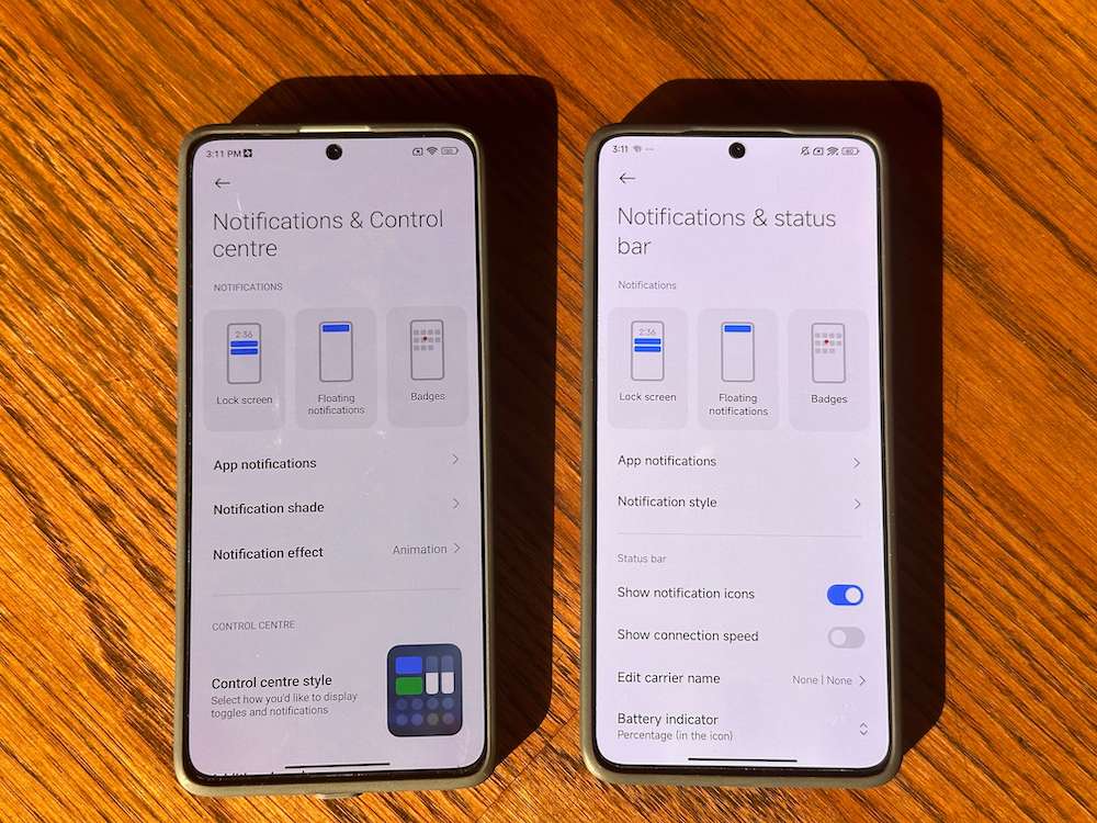
However, we are not sure whether we are totally sold on it because, in a place like Settings, a bit of detail is sometimes welcome, especially for non-geeks. For instance, the Control Centre, which was mentioned up front in MIUI’s Settings in Notifications and Control Centre, is now shifted to the Notifications & Status Bar in HyperOS. Thankfully, the Search works as efficiently as ever.
The Control Centre is VERY different and has a music player inside

Swipe down from the right side of the display, and the first really big change in HyperOS will become evident. The Control Center in HyperOS has larger icons and is arranged in the form of one single scrollable screen by default, unlike in MIUI, where the shortcuts are arranged in panels that you can scroll sideways. By default, no text accompanies the icons in the HyperOS Control Center, which we think is a bit of a slip-up as most people do not actually remember what each icon stands for. Fortunately, this can be rectified by going to the Notifications & Status Bar and turning off Don’t Show Icon Labels. Also very noticeable is the fact that the Control Centre now has music player controls in it, which is very handy indeed.
Comes with lock screen magic

One of the most noticeable changes in HyperOS is the arrival of new lockscreens, which are highly customizable and some of which even have depth of field effects (a la iOS). You get three lockstyle options – Classic, Rhombus, and Magazine. Classic is the relatively plain one, but it is Rhombus and Magazine that really brings the lockscreen to life with a number of clock options and effects. We can see people spending a lot of time playing with this feature. Enough to merit a tutorial in its own right (yes, we are working on it!).
The icons and colors are subtly different

Remember how we began by saying that the icons on both HyperOS and MIUI pretty much seem like carbon copies of each other at first glance? Well, from glance number two and onwards, you will start noticing very subtle differences. These changes will not be apparent on devices running launchers like the Poco X6 and Poco X6 Pro, both of which run the Poco Launcher, but they will slowly become evident on devices running MIUI 14 and HyperOS. Icon colors are less bright, and there are many small tweaks in the icons, such as:
- The sun in the Gallery icon is on the left in HyperOS and on the right in MIUI 14
- The Themes app icon has no yellow or blue in it (unlike in MIUI 14)
- The minute hand in the Clock icon is white rather than red
- The Notes app icon has a slimmer pencil and a small tick
- The Cleaner app actually displays how much memory it can free up on the garbage can in its icon
- The Calendar app displays the date above the day instead of the other way around in MIUI 14.
- The music app has a thinner music note symbol.
As we said, these are very subtle changes and might not even be noticed. Do we like them? Well, we think the overall look is cleaner and more elegant, but we can see some preferring the brighter and more punchy colors of MIUI 14.
Menus are similar but have been moved lower, and items reordered
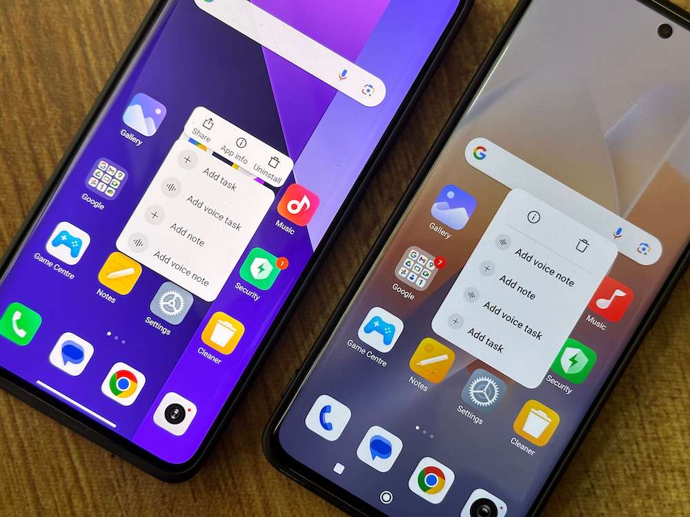
It is not just the icons of system apps that have been tweaked. Their menus have been subtly altered, too. HyperOS seems to prefer putting menu options at the base of the app, as compared to MIUI 14 which had kept them at the top. We noticed this in the Notes, Gallery, and Files app. We like the change as it makes the apps easier to use – one does not have to reach across to the upper part of the display. The menus have also been subtly changed and reordered in the apps that support 3D Touch (long pressing an app icon). There is lesser text, but the font itself is larger, and the icons in the menu have no labels. Is this more convenient? It is too early for us to say.
There is a Dynamic Island…of sorts
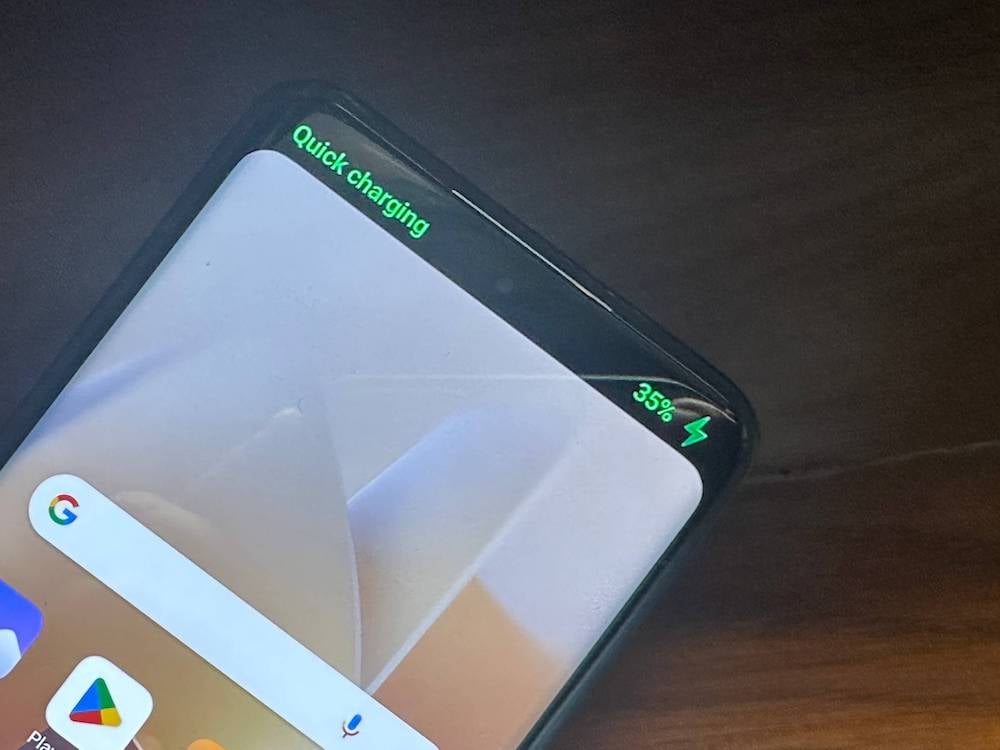
Android has been so late to the Dynamic Island party that we can even consider its invite to have expired. HyperOS, however, has added some tricks around the punch hole notch on the display, which many refer to as the Dynamic Notch.
Out of the box, it does not do much – the area around the notch darkens into a dark panel of sorts and shows charging speed (Charging or Quick Charging) and battery percentage when you plug in a charger. It also comes to life when you switch the phone to silent mode or switch on the mobile hotspot feature (mind you, the ‘dynamic island’ appears only when you do this from Settings, not from the Control Centre). It is a nice touch but rather limited as of now. Maybe app developers and Xiaomi itself will try to do more with it in the coming days.
The Weather app gets a dash of color
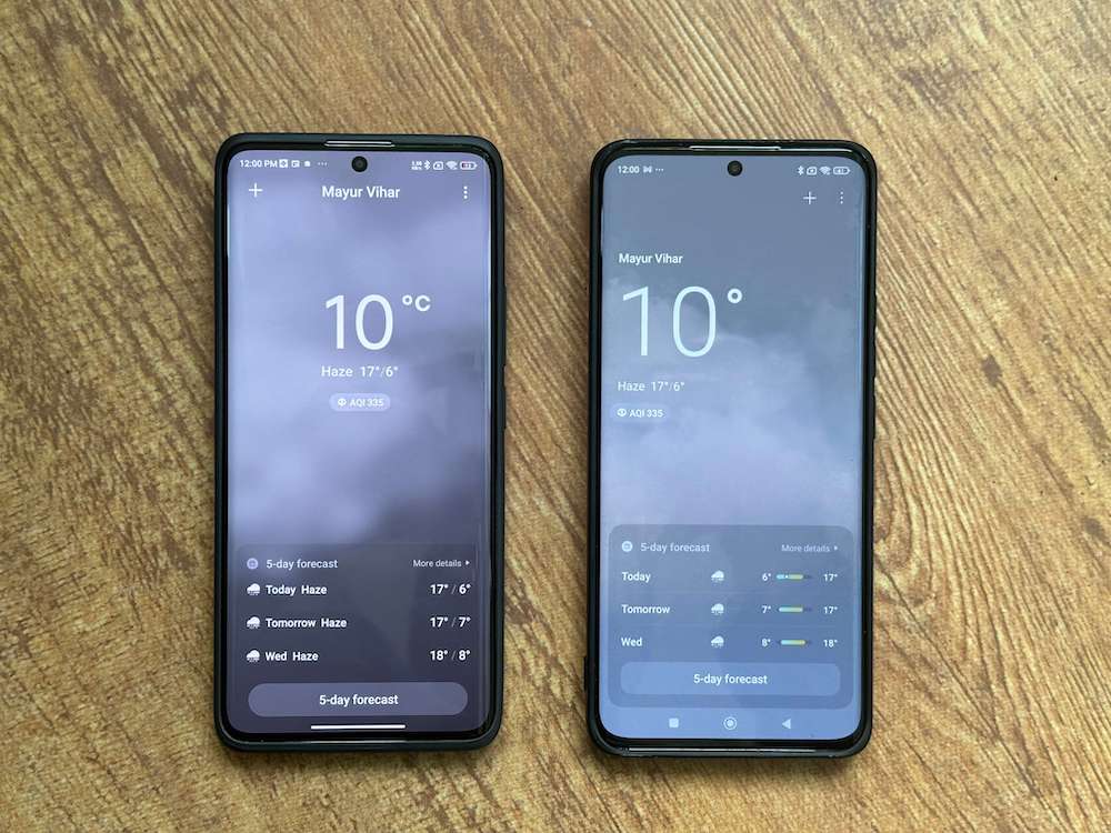
The system apps and accessories that come with HyperOS are very similar in terms of interface and usage to the ones with MIUI. The Weather app has, however, been changed. Rather interestingly, while the general look of HyperOS is towards the understated and minimalist side, its Weather app is a little more colorful, with more icons and less text. We are told that it has been designed to depict the weather more realistically, and while we are not sure it does that, although images do seem a little sharper on it, the overall look is a definite improvement over the slightly dull weather app on MIUI.
Lesser storage space taken
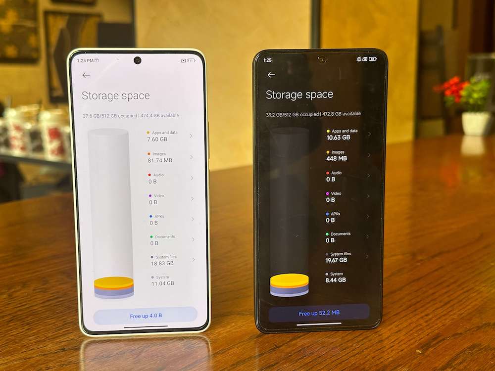
HyperOS is supposed to take lesser storage space on devices, and that seems to be true. We compared the space taken by HyperOS on the Poco X6 Pro as compared to the space taken by MIUI 14 on the Poco X6 and saw that while the System occupied 8.44 GB on the HyperOS device, it occupied 11.04 GB on the MIUI 14 one. Yes, System Files, Apps, and data might vary, but HyperOS tipping the scales under 10GB is very impressive indeed.
Battery life seems better
Another claim about HyperOS was that it resulted in better battery life, and that certainly seems to have happened with the Xiaomi 13 Pro. We are getting an additional hour and a half to two hours comfortably on the device. We used to get close to a day of full usage if we kept the device at quad HD resolution. Since the HyperOS update, it sees off a day easily. We would ask you to be patient, though. The update initially seemed to have adversely affected battery life, cutting it by a few hours, but the days since have seen it improve.
And one more thing:
Is it smoother? Yes, but honestly, it does not really jump out at us
The big question, of course, is whether HyperOS works more smoothly than MIUI 14. The answer is yes, it does. But this does not become evident for quite a while. We were comparing the performance of the Poco X6 Pro (running HyperOS) with the Redmi Note 13 Pro+, and while both devices seemed to work similarly, after a few days, the Poco X6 Pro seemed a little smoother and slightly more elegant. Mind you, we labeled icons in the Control Centre to use it better. We cannot get HyperOS’ hatred for icon-labeling in the Control Centre or even in some of the app menus that get invoked when we use 3D touch, but there’s no doubt that it actually is smoother than MIUI.
A nutritious meal, not junk food
“Wait, watch, and you will see the difference” is pretty much what we would advise anyone using HyperOS after having used MIUI. As we stated earlier, the difference between HyperOS and MIUI will not leap out at you. In fact, barring that new lock screen, not too much really will.
That is because HyperOS is not junk food whose taste will assault your senses with the very first few chews, but is more like a super nutritious meal that might seem a little bland initially but whose taste becomes apparent with the passage of time. As time passes, you not only start liking its subtle, more nuanced taste but also realize that you are feeling healthier.
We will know how well it works with other device categories only when it is released on them (the Xiaomi Pad is next, we hear), but as of now, it is a bit like James Bond walking into the Marvel Universe – no visible super powers, no jazzy costume, just an elegant, black suit…but with a lot of weapons inside it!
Now, bring it to the tablets, TVs, and everything else, Xiaomi.
